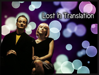
Okay, so the few of you who do read this are probably thinking, "wow we don't care about your fake Photoshop or the things you make"...or maybe "seriously, you need a life." But, I can't help it, I like to take pictures, photo manipulate, and mess around on computers. So, I thought maybe instead of just posting the finished result, I do a little writing about how I made this...so if you want you could do your own. (Which fyi I post these because I usually have no reason for making them and therefore nowhere else to put them except the internet, and also I'm proud of how much I'm learning about these programs). Well, really you should stop reading now if you really do not care about how to make something like this...because the rest is just a sort of tutorial.
Okay, these are all done on Gimp - an open source graphics editor, so if you too wish to have Photoshop but cannot afford it due to the astronomical price, try Gimp, it really is a nice alternative and best of all FREE. Now for a bit of a tutorial:
Open up Gimp and make a new image. Mine was 1600 x 1200, fill in the background with black.
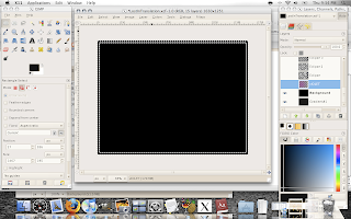
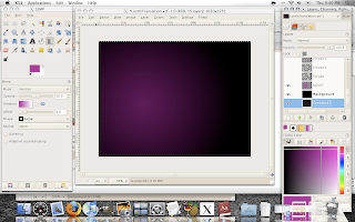
Okay go to your layers menu, and create a new layer...I called mine violet. Select the gradient tool (the can like icon that fades from gray to white). Change the color to #b10993 and the shape to radial, change the radial opacity to 50. Select somewhere near the middle of your image and drag the cursor to a corner.
Create a new transparent layer - I called mine Eclipse. For the next step, I actually used a brush I made (with someone else's help, but now I know how to make brushes too! cool). I'm not going to go into brushes now though, you can simply select the elipse selection tool. Change the layer opacity to around 60. Draw a circle, and fill it with white. Add a number of different sized circles (though be aware we will add more, so don't over do it). When you finish, select none( Select -> none) and then add a Guassian Blur (Filters->Blur->Guassian Blur) radius 30.
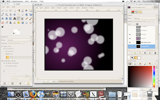
Create another transparent layer, call it eclipse 2 - put the opacity of the layer around 60 again. Go ahead and add more circles. Then Gaussian Blur this layer with a radius of 10.
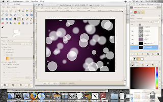
Create another transparent layer, call it eclipse 3. Draw in anymore circles you want - layer opacity still around 60. When you've finished, Gaussian Blur it also, only with a radius of 1.
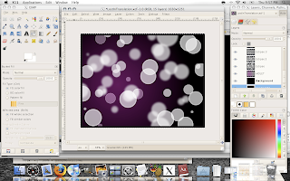
Now, create a new layer - call it Clouds. Fill it with white. Now go to Filters->Render->Clouds->Difference Clouds. Change the detail to 4, and check randomize and tileable (this is what I did at least...have fun with it). Then change the layer menu mode to overlay.
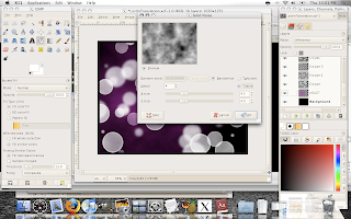
Create another layer (I know I use like a million layers) - I called mine Gradient. Once again, select the gradient icon, this time change the linear to shape and the the gradient to FG to BG (HSV counter-clockwise). Now I set my foreground color (the color boxes at the bottom of the icons) to white and the background to the violet from before. Apply the gradient to the layer (I did bottom corner to top). Once again change the mode to overlay.
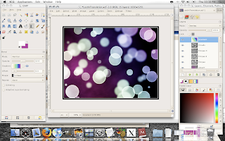
For another fun gradient, select Full Saturation from the gradient menu...more colors in the spectrum if you want.
Okay a few finishing touches for the background. Select your eclipse layer 3, and change the layer mode to Grain merge. Select eclipse layer 2, and change the layer mode to Hard Light. I added a border, by changing the canvas size (1650 x 1250), adding a layer at the very bottom and filling it with a dark gray. And Voila! this is cool on it's own. (Thanks to PA blog).

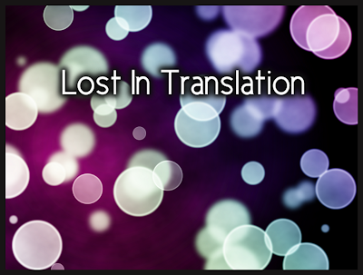
When I finished, for some reason the feeling of the image really reminded me of Lost in Translation (is it weird that images have feelings to me? Songs do too.) So I decided to keep going with it...get some more practice as well. So the next step was adding the "Lost in Translation" text. One thing you should know, Gimp's font selection is severely lacking, so I'd suggest downloading more (dafont has a bunch on free good ones).
Create a new layer - call it text. Choose the Text icon (an uppercase A), write in what you want, place it where you want, the size you want, color, font, etc. Merge this with your text layer (from the layer menu, layer->merge down). Now from the layer menu choose Alpha to Selection. Then, from the image Select->Grow, grow it by 10.
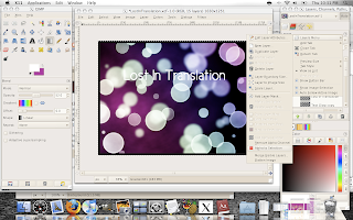
Create a new layer - call it text glow. Fill in the selection with a dark gray or black. Move the layer behind the text. Select none, and the Gaussian Blur, radius 45. Duplicate this layer, and Gaussian Blur that layer with a radius 30.
For the final part, select an image you want on the foreground...I chose Bill and Scarlett as you saw before. Open up the image, and you will have to select the portion you want in your image with the paths tool (the old school pen top icon on the top right corner). Zoom in on your image, and start outlining the parts you want with the paths tool.
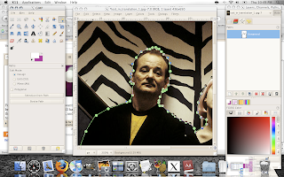
Once you've finished outlining, go to the paths tab on the layers box, then the paths menu...Paths menu->path to selection.
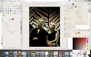
From the image, Select->Feather, and feather the selection by 2 or 3 (more if your image is very large). This will make your selection not so sharp around the edges. Now copy the selection and go back to our original image. (Be careful with the sizes of the two images, make sure they are comparable, or what you want at least). Create a new transparent layer, and paste on your selection. Move it around however, and even mess with the opacity, coloration (dodge/burn will darken or lighten, color menu for other cool things) etc.

Here's an alternate version I did:
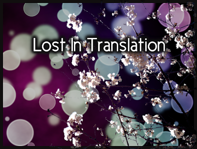
Don't worry, I didn't use the paths tool to select the cherry tree - that'd be crazy, another trick though. I did darken the background, and made the cherry tree slightly transparent.
Well, if you made it this far, I guess you like Gimp too. Any questions, let me know. And I swear, I'll get back to normal blogging next. Also, listen to Alone in Kyoto by Air. It's featured in Lost in Translation and a great song by its own right. Ciao.
2 comments:
very cool result there. i like the way u add pic and text to the bokeh.
:)
Post a Comment